FOR IMMEDIATE RELEASE
May 11, 2020
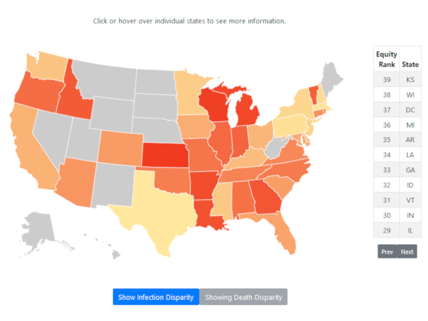
BERKELEY, CA: A new interactive “heat map” released Monday shows how different states across the country are experiencing disparities in infection and death rates by race, which may offer clues in how state-level policies and underlying vulnerabilities of a region could be impacting populations differently.
The map, developed by the Othering & Belonging Institute at UC Berkeley, allows users to toggle between one version showing infection rates, and another version showing death rates, with each state assigned a color based on the level of disparity between any one racial group and that state’s general population.
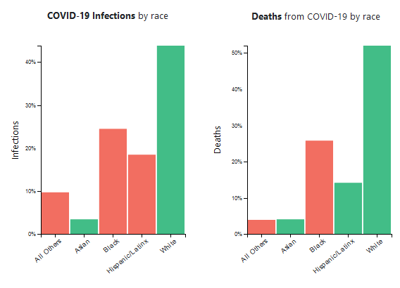
The map uses data collected by the COVID Tracking Project, which reveals that in almost all cases, Black and Hispanic populations are being infected and dying at significantly higher rates than the general population.So far the limited data available on Covid-19 infection and death rates by race makes it difficult to draw conclusions from a comparative analysis between states. Racial data is missing for many states, and the states that are reporting racial data may be reporting incomplete figures, and using inconsistent measures.
But based on this limited data, the top three states that appear to be experiencing the worst disparities in death rates include Kansas, Michigan, and Louisiana. When measuring infection rate, the most disparate states are South Dakota, New Mexico, and Rhode Island.
In terms of the least disparate states, Texas, Massachusetts, and Pennsylvania are among the top three in both measures of death and infection rates.
"While the data remains limited, a picture is beginning to emerge showing the disproportionate state-by-state impacts of this pandemic," says Stephen Menendian, one of the researchers with the Othering & Belonging Institute investigating how the pandemic is being experienced differently by race.
As more data becomes available, the map may reveal more defined patterns in how states’ responses to the pandemic could impact different populations, especially those that are more at-risk of infection and death due to social conditions including inadequate access to care and resources experienced more frequently in communities of color.“One of our hopes is that the map can be used as a tool for policymakers to see what kind of actions are working, and what’s not so we can focus on closing the equity gaps we’re seeing across the country,” says Arthur Gailes, an Institute researcher who developed the heat map.
The map is the latest tool released by the Othering & Belonging Institute as part of its effort to document and visualize the impacts of Covid-19, and assist aid organization and state agencies in deciding how to allocate resources based on need.
The Institute last month released a separate interactive map showing multiple layers and metrics that identify regions in California that may face increased risks associated with the pandemic, and includes measures such as air pollution, hospital beds per capita, regions lacking health insurance, and many others. That map does not include racial data.
Media Contact
Marc Abizeid
marcabizeid@berkeley.edu
###


