Our ultimate aim with this project is to raise awareness of the extent and persistence of racial residential segregation in the United States and to draw attention to its connection to structural racial inequality. Our aspiration is that our interactive map and data will be used by fair housing advocates, policymakers, and educators to study the problem of segregation, its effects, and to inform litigation and policy reforms. To accomplish these goals, our immediate objective is to make our mapping tool the most widely used (and useful) segregation map in the United States.
There are a number of other static or dynamic racial residential segregation maps that can be accessed free of charge on the internet, but many of them are not actually segregation maps. For example, a mapping tool that Wired Magazine dubbed “The Best Map Ever Made of America’s Racial Segregation” is not, in fact, a segregation map.1 Although visually stunning and suggestive of racial segregation, the map is actually a racial composition map, illustrating the presence of members of different racial groups in different communities. Similarly, “JusticeMap” combines demographic information on race and income for some revealing data visualizations. But these visualizations, at best, imply segregation, and do not represent it.
A few years ago, the Washington Post launched a mapping tool that purported to represent segregation and diversity in the nation’s largest metropolitan areas.2 Similarly, three highly regarded academic institutions launched a website that purported to represent diversity and segregation for all 50 states and the nation’s 53 largest metropolitan areas.3 There is even a website called “Mapping Segregation” which presents an assortment of racial composition “dot” maps and Home Owners Loan Corporation “redlining” maps.4
These well-intended efforts are misleading, however, since racial composition, racial demographics, and even racial diversity itself are not the same thing as racial segregation, which represents the degree of residential separation and distance between members of different racial groups. A place can be diverse and segregated or diverse and integrated. Not only does our map directly show racial residential segregation itself, indicating the level of segregation in every neighborhood in the United States (as well as indicating the racial composition of that tract), it does this for every major measure of segregation.
We believe it is the most sophisticated interactive racial and economic segregation mapping tool ever created because of the multiplicity of measures and timescales that can be visualized. Among its assets:
- Many measures. In addition to the default display, our map allows users to select among eight (8) entirely different measures of racial segregation indicating more than 30 different expressions of segregation, in addition to our default and bespoke measurement created for this project.
- And as of our 2025 update, this also includes four measures of economic diversity/segregation: Income entropy, Relative Neighborhood Income Category and Income Polarization Index, and Dissimilarity Index for income segregation.
- Multiple geographic levels. These measures can be represented at the regional, city, county or census tract level wherever applicable.
- Many different points in time. The racial segregation measures are displayed for the years 2023 ACS, 2020, 2010, 2000 and 1990. In the 2025 update, we had to remove 1980 because we updated the map to 2020 census boundaries. Users can use the ‘sliders’ to observe change between years. However, the economic segregation measures are displayed for 2023 ACS only.
- Racial composition. In addition to measures of segregation, users can select tracts, cities, counties or regions to display racial composition for the selected geography.
- Redlining. Users can select the HOLC ranking layer to observe HOLC designations relative to segregation values.
- Stories. The navigation bar also provides “city snapshots” and citations (with links) for “local histories of segregation” for selected geographies.
In summary, our map is distinct from every other available segregation map as a “super” segregation map, with more measures than any other we are aware of. However, because of the volume of viewing options, users will need assistance to understand how to use our tool beyond the default settings.
This appendix is intended for the reader who wishes to delve more deeply into our methodology, understand our measures better, or get the most out of the mapping tool. In this technical appendix, we explain in more detail what segregation is, how to measure it, what each measure of segregation represents (that is, what question it answers), but also what it obscures and its respective limitations as a definitive gauge of racial residential segregation.
We also present and explain our novel measure of integration, which we feature in our map and upon which our tables are based. In the process, we hope to impart a clear understanding of how to use every feature in our mapping tool, and therefore how to make the most of it, for whatever purposes you may have in mind, whether they are for advocacy, policy change, research and scholarship, or just a better understanding of the problem.
Defining Segregation
Segregation is the separation across space of one or more groups of people from each other on the basis of their group identity.5 Racial segregation is the separation of people from each other on the basis of race. Racial residential segregation is the separation of people on the basis of race in terms of residence, rather than some other form, such as occupational or educational segregation, or the segregation of public accommodations, such as buses, trains, restaurants or theaters. These forms of segregation can occur together or not. Places of worship may remain segregated, for example, even as schools and workplaces integrate.
Similarly, some forms of racial segregation can coexist with other forms of segregation or integration. Economic segregation is the separation of people on some economic basis, such as income, socioeconomic status, or wealth. Economic segregation generally refers to people of different classes residing in different neighborhoods or even municipal jurisdictions. It is possible to have economic integration without racial segregation, or vice versa, both can (and tend) to co-occur.
The term “segregation” has certain connotations that can lead to confusion, especially when used in more precise and descriptive ways. For example, when speaking of “segregated” schools or neighborhoods, many journalists, scholars, or courts are referring to those that are predominantly non-white. Thus, a “segregated school,” let alone a “hyper-segregated” school, generally refers to a heavily Black or Latino school.6 Or a “segregated community” may refer to a Chinatown, Japantown, or other ethnic or racialized area.
Upon reflection, however, it should be obvious that segregated non-white schools cannot arise or exist without the co-creation of segregated white schools. In the Jim Crow South, for example, pupil assignments were made on the basis of race, with state laws and school district policies requiring white students to attend white schools and Black students to attend Black schools. Both sets of schools were segregated, and this was accomplished through the same means (pupil assignments based on race). To regard one set of schools as segregated but not the other is nonsensical. White and Black segregation, in this case, are reciprocal of each other. But commentators pointing to “segregated schools” tend to refer to predominantly Black and Latino schools, but not their white counterparts.
This leads to another nuance with respect to segregation: the difference between de jure and de facto segregation. De jure segregation refers to segregation that occurs by force or under the color of law. De facto segregation describes segregation that occurs due to other reasons, including, but not limited to, individual preferences and private or market-based discrimination.
Some jurists and policymakers claim that segregation must be the manifestation of a deliberate and intentional effort to segregate. The implication is that any result not caused by an intentional segregative force is not segregation, but mere racial isolation, imbalance, or separation. These semantic debates are unfortunate for a number of reasons, not least of which is that numerous private and public decisions are so deeply interwoven as to make it impossible to claim that public policy played no role in causing or sustaining de facto patterns of racial residential segregation.7 But whether segregation is sustained explicitly by law and policy or by the unintentional or complex interaction of policy and private decision making, the harms may be just as serious and grave, and may justly merit a forceful policy response.
None of the foregoing is intended to suggest that all forms of racial separation are harmful. Certain forms of racial and ethnic solidarity and community, such as ethnic festivals or pride parades, religious services, holiday celebrations, or social gatherings are either innocuous or beneficial. But when segregation leads to the inequitable distribution of resources or access to life-enhancing goods or networks, then it is a source of great harm.
Because of the centrality of “place” to critical public goods, such as schools, hospitals, jobs, and recreational green spaces, high levels of racial residential segregation is strongly indicative of racial inequity, and a very likely source of racial disparities, as the research canvassed in the main body of this report illustrates. Thus, we should be more keenly aware of the degree of racial residential segregation in our communities. Our maps can help users do this.
Measuring Segregation
Segregation is a surprisingly difficult concept to map and measure.8 This is because, upon close inspection, it is a multi-faceted concept that describes varying, and often quite different, patterns of group-based separation.9 We will present and describe the measures of segregation we have included in our mapping tool, and indicate what they represent.
In our map, the base units of geography are:
- Census tracts: These are small, relatively permanent statistical subdivisions of a county that contain, on average, 4,000 people.10 These are used as proxies for neighborhoods in this research.
- Cities: These are geographies within each state identified as “Incorporated Places” by Census and are an intermediary geography between tracts and CBSAs.
- Counties: These are the primary legal subdivision of most states. In Louisiana, these subdivisions are known as parishes.11
- Core-Based Statistical Area (CBSA): CBSAs are the Metro- and Micropolitan Statistical Areas of the US, which contain at least 10,000 people and are meant to represent normal commuting patterns.12
The default layer of the map presents the entire United States, and displays the level of segregation or integration for every CBSA . In some cases, the measure cannot be calculated at the tract level, and in those cases, the map will not render it at that level of geography. A description of what these designations indicate is provided below our summary of the measures included on the map.
I. The Dissimilarity Index
The most common measure of segregation is the Dissimilarity Index.13 When presented with a claim about the overall level of segregation in a community or a statistical claim of segregation, it is more likely than not that such claims refer to the Dissimilarity Index.14 This index measures the degree of segregation that exists between any two racial groups by indicating the percentage of either racial group that would have to move to a different-race neighborhood to create perfect integration.
Scored from 0 to 1 or 0 to 100 (the same values just rescaled to either range), a higher value indicates a higher level of segregation, with a value of 0 indicating perfect integration and a value of 1 (or 100) indicating complete segregation. Generally speaking, anything above 0.6 or 60 is considered “highly” segregated, while anything between 0.3 and 0.6 is moderately segregated.15 At the national level, the United States scored a 59 according to the Black-white Dissimilarity Index in 2010, meaning that 59 percent of white or Black people in the United States would have had to move to achieve perfect integration. In 2020, Black-white Dissimilarity Index is 64 which indicates worsening segregation as per this measure.
Our mapping tool provides four different dissimilarity scores: Black-white, Hispanic-white, Asian-white, and Black-Hispanic. Toggling between all four measures, you can see very different degrees of racial residential segregation across the United States depending on the sub-measure. With this understanding of what the measures mean, you may feel free to skip ahead to the next subsection, describing the next measure. The remainder of this section describes the limitations or flaws in the Dissimilarity Index.
The Dissimilarity Index suffers from at least four serious limitations, only some of which exist for other measures. First, it is a binary measure of segregation that only describes the degree of segregation that exists between any two racial groups at a time. As this index has been used most frequently to indicate or characterize segregation between Black and white people in a region or city, the Black-white values may conceal increases or substantial changes in white-Asian or white-Latino segregation (as is the case for a for a number of cities mentioned in our FAQ). This is especially problematic when the Black-white dissimilarity score is being used to represent general levels of segregation in a diverse region.
This drawback can be mitigated somewhat by examining the dissimilarity score for multiple racial pairings or by aggregating all non-white groups. But the Dissimilarity Index fails to provide a single, holistic value for all racial groups simultaneously. For states or regions of the country that are highly diverse, such as California, Texas, New York City, Miami, or Seattle, the Dissimilarity Index is not among the most useful or revealing measures of segregation. It can obscure the overall patterns of segregation by focusing on a particular racial pairing to the exclusion of other dynamics.
A second problem with the Dissimilarity Index falls under the header of the “modifiable areal unit problem,” which are actually a subset of problems related to changes in geographies.16 One of the most serious aspects of this general problem is that the Dissimilarity Index becomes “progressively more inaccurate and misleading as either the overall population of the area analyzed, the number of geographic units, or the relative size of either of the compared groups becomes smaller.”17 This makes it hard to compare scores between places using the Dissimilarity Index.
A third and related problem is the lack of “decomposability.” The Dissimilarity Index generates a single value for any given geography, typically a metropolitan area, and therefore cannot tell you much about patterns of segregation within that area.18 Thus, it is useful for comparing the overall levels of segregation within the same metropolitan region over time or between different metropolitan regions, but is insensitive to particular patterns of segregation within that region. For example, it cannot tell you whether segregation within a region tends to be neighborhood segregation within cities or segregation between municipalities, or whether particular neighborhoods are more or less segregated within that region. Other measures of segregation can.
Finally, and perhaps most seriously, the Dissimilarity Index values mask the average or typical case. Dissimilarity Index scores can improve when a small number of members of a different group move into previously homogeneous neighborhoods, while the average or typical member of those groups remain stuck in racially segregated neighborhoods. For example, if middle-class African Americans move into previously exclusively white neighborhoods (as they in fact did), the dissimilarity score can drop, even if the vast majority of Black people remain in racially isolated neighborhoods. To get a sense of the “average” case, we will need another measure of segregation altogether, the Isolation Index. But these flaws with the Dissimilarity Index are why we did not make it our default measure.
II. The Isolation Indices
There are two isolation indices, the Isolation Index19 and the Exposure Index.20 These indices measure the flip sides of each other and seek to calculate the degree of “exposure” or isolation experienced by the average member of a particular racial group. The only difference is that the Isolation Index measures “exposure” to the same race. Together, these indices tell us the neighborhood racial composition of the average person of a particular race.
In the United States, the average Black resident resided in a community that was 41 percent Black, 34 percent white, 17 percent Hispanic, and 6 percent Asian in 2020. A similar community racial composition existed for Hispanics in 2020. The average Hispanic lived in a community that was 45 percent Hispanic, 34 percent white, 12 percent Black, and 8 percent Asian.21
What is important or novel about the isolation indices is that, rather than looking at overall patterns, they focus on the typical, or average, case. An Isolation Index score of 50 indicates that the average African American resides in a community that is 50 percent Black, whereas a Black-white Exposure Index score of 30 suggests that the average African American lives in a community that is 30 percent white. Similarly, a white-Black Exposure Index score of 10 suggests that the average white person lives in a community that is 10 percent Black.
Our map allows users to observe Black, white, Asian, or Hispanic isolation, as well as the exposure values for nearly every CBSA, county, and city between all four racial groups (white-Black exposure, white-Asian exposure, white-Hispanic exposure, and so on), offering a total of sixteen different measure values.
In several respects, the isolation indices are a superior measure of segregation to the Dissimilarity Index. While a significant number of African Americans have integrated in previously all-white neighborhoods—causing much of the decline in the Black-white dissimilarity score—many African Americans still reside in segregated neighborhoods. By focusing on the average or typical member of a race, the isolation indices give us a different, perhaps more relevant, sense of how segregated a particular racial group remains.
Nationally, Black Americans in 2010 had an Isolation Index score of 45, which means that the average Black American resides in a neighborhood that is 45 percent Black. The Detroit metro area featured the highest Isolation Index value for African Americans (80.9) in 2010, suggesting that the average African American resides in a neighborhood that is nearly 81 percent Black, a strikingly high number, and one similar to its 1980 Isolation Index score. Many Rust Belt and southern metro areas fall in the top 10 metros for high Isolation Index scores for African Americans. A higher number of metros in the western region of the nation reported lower Isolation Index scores for Blacks in 2010, e.g. Los Angeles metro, Oakland metro, Riverside metro and Las Vegas metro.
While the Isolation/Exposure Indices are quite useful for helping us observe the degree of racial residential segregation experienced by different racial groups, they are still binary measures, indicating the exposure of one group to another. And like the Dissimilarity Index, these measures cannot be “decomposed” into census tracts or smaller geographies. In addition, these index values must be presented with additional context to tell us what these numbers mean.
Relatively higher or lower exposure and isolation values might be a product of a smaller racial group population rather than meaningful integration. For example, low levels of isolation may exist because a racial group is too small to predominate a community, even if that group is comparatively isolated. In particular, in regions where the white share of the population has significantly declined in relative terms, decreasing “exposure” to white people may simply be a product of changing racial composition than a decrease in that group’s segregation from white people.22 In deeply diverse contexts, the Exposure Index may mislead as a true indication of whether segregation is improving or worsening in a holistic sense.
III. Entropy Score
The Entropy Score has become one of the more widely used measures of “segregation” and “diversity.”23 Both the Washington Post map and the MixedMetro map described in the introduction to this appendix employ the Entropy Score. Scaled from 0 to 1, a higher value suggests a greater degree of diversity. Within this range, research suggests that scores less than 0.37 can be categorized as “Low Diversity,” whereas scores greater than 0.74 can be categorized as “High Diversity.”24 Values between these two thresholds can be categorized as “Moderate Diversity.” We can assess diversity of any geography as long as we have data for each racial group, and these groups are mutually exclusive. For example, to calculate the Entropy Score for a county or a tract, we need data on the proportions of mutually exclusive racial groups within the geography of interest.
The Entropy Score provides a holistic value that represents the overall diversity of an area, and for all racial groups at once. On the other hand, the score goes up as the number of people of different races increases, irrespective of their physical or spatial distance. In other words, the Entropy Score is a measure of diversity, and not really a measure of segregation per se.
Nevertheless, we provide an Entropy Score value for every census tract in the country for all four decennial census periods (it is “decomposable,” unlike the previous two measures). It provides a useful sense of how racial demographic change has occurred in communities with an absolute value that indicates growing or receding diversity.
IV. The Diversity Index
Closely related to the Entropy Score, the Diversity Index is a measurement for diversity.25 It was originally designed as a way to estimate species diversity within an ecological environment or biological context, and is otherwise known as the Simpson’s Diversity Index. The strength of this measure can be seen in its common use in the social sciences, particularly to track racial and ethnic demographic diversity.26 While the Diversity Index and Entropy Score are both measures for diversity, and therefore have some degree of overlap, we decided to include the Diversity Index in our dataset and mapping tool as well because of its importance in the field of segregation and our intention to provide a broad range of measures.
We can use the Diversity Index for any geography as long as we have data for each racial group, and that these groups are mutually exclusive. The Diversity Index calculation itself is scored from 0, which represents a geography without diversity, to 1, which represents a geography with maximum diversity. Let us take the city of Los Angeles, CA as an example which has a Diversity Index value of 0.6742 in 2020. This suggests there is a 67.42 percent chance two people chosen randomly in the city will be of different racial and ethnic groups. Furthermore, if this measurement is in the 92nd percentile for all cities in the United States, then we might interpret that Los Angeles is a city with relatively high diversity.
A strength of the Diversity Index is that it’s a composite measure that takes into account the distribution of all recorded racial and ethnic groups at the level of a particular geography. This means that it moves beyond the limitations of the binary measures which might be represented by the Dissimilarity Index measures.
A limitation of the Diversity Index is it isn't a decomposable measure, where a measurement at a particular geographic level can be nested and compared to measurements at other geographic levels. One last important caveat to note is that the Diversity Index simply measures racial and ethnic diversity, which is related to, yet distinct from, segregation.
V. Entropy Index or Theil Index (Information Theory Index)
Theil27 defined Entropy Index28 as a measure comparing the racial diversity (entropy score) at the small geographic level (tracts in this analysis) to the racial diversity at the bigger geography (CBSAs in this analysis). The entropy index varies between 0, when all areas have the same composition as the entire metropolitan area (i.e., maximum integration), to a high of 1, when all areas contain one group only (maximum segregation).29 Higher the index value, greater is the segregation.
This measure, however, has some shortcomings. The Theil Index is not intuitive as a segregation measure. Additionally, since entropy scores use logarithmic equations, these are highly sensitive to extreme values. And, a ‘0’ input value renders the log value undefined. We resolved this problem by ignoring the racial groups which had a ‘0’ value.
VI. The Divergence Index
This leads to our preferred measure of segregation: The Divergence Index.30 The Divergence Index provides a holistic value for the level of segregation in any American community.31 The Divergence Index measures segregation at any geographic level and, thus, better matches the common sense definition of segregation.
The Divergence Index compares the relative proportions of racial groups (or any other groups) at smaller and larger geographies, looking for the degree of “divergence” between the two geographies, such as between a census tract and a county.32 For example, consider a census tract with the following racial distribution: 76 percent Black, 11.9 percent Latino, 9.3 percent white, and 2.8 percent Asian. Now what if that census tract is situated within a CBSA with the following racial distribution: 66.7 percent white, 11.9 percent Black, 10.8 percent Latino, and 10.6 percent Asian. Such a census tract will have a very high observed level of segregation as measured by the Divergence Index because it "diverges" so greatly from the surrounding region, especially in terms of the differences in proportion of Black residents. Indeed, the formula results show that this tract’s Divergence Index value is 1.21, a pretty high score.33
To calculate the metropolitan CBSA (county, or city) score, we add the scores for each tract in the region, but weigh them by the tract’s population. In the case of the tract and region described above, the region’s CBSA Divergence Index score is 0.2642 as of 2010 (this happens to be the San Francisco-Oakland-Fremont CBSA).
The lowest possible value of the Divergence Index is "0" when the demographics of a smaller geography does not differ, or diverge, from that of the larger geography, suggesting no segregation, whereas higher values suggest higher divergence, and hence higher segregation.34 As the Divergence Index is a relatively novel measure of segregation, as of yet, there is no established set of ranges to demarcate varying ranges that indicate the level of segregation in the relevant academic literature.
To address this issue, we take two approaches. First, for the Divergence Index, we sort areas by their divergence score to rank them in order of segregation (for which the Divergence Index is our preferred measure). Relatedly, our map emphasizes the Divergence Index percentile rank rather than raw score. This approach is useful for locating the most segregated cities and metropolitan areas in the United States without having to resolve the issue of delineating a precise threshold. Second, to categorize tracts, we combine the Divergence Index with other measures presented in this report, described in “Measuring Integration,” below.35
We believe that the Divergence Index is both more accurate and more precise as a measure of segregation than more traditional measures. It is more accurate because, by accounting for all racial groups simultaneously, it provides a more holistic sense of the overall level of racial residential segregation in a single value than can be conveyed, for example, by a Dissimilarity Index value.
But the Divergence Index is more precise as well because it is also “decomposable,” meaning that it allows us to understand the dynamics of segregation at a more granular level than is typically possible with more popular measures. The Dissimilarity Index, for example, yields a value for an entire geography (such as a city or metropolitan area). Because the Divergence Index is decomposable, it can produce values at more granular levels of geography without requiring access to special microdata.
Relatedly, on account of this advantage, the Divergence Index allows us to distinguish between certain forms of segregation, such as “between-place” (or inter-municipal or regional segregation) and “within-place” (or intra-municipal) segregation.36 In other words, the Divergence Index allows us to measure the degree of segregation between neighborhoods within a city compared to the degree that it exists between cities within a metropolitan region.
A Note on “Between-Place” and “Within-Place” Segregation
To appreciate the difference between these two forms of segregation, compare two highly segregated cities: Memphis, Tennessee and Hialeah, Florida (one of the principal cities in the Miami-Dade metropolitan region). Memphis is the 33rd largest American city, with about 650,000 people in 2019, while Hialeah is the 100th largest city, with about 225,000 people. Both cities are superficially similar in key respects.
Both cities are predominantly cities of color, and strikingly so. Memphis is about 64 percent Black, one of the highest proportions of African-Americans per city in the nation. It is also 26 percent white, 7 percent Latino and 2 percent Asian. Hialeah is about 95 percent Latino, also one of the highest proportions for a top 100 city by population.
Given these facts, it should be unsurprising that both cities are also highly segregated. A majority of tracts in the northern and southern parts of Memphis are highly segregated communities of color. Tracts in the central part of the city, extending into the neighboring Germantown and the northern parts of Collierville are highly segregated white neighborhoods. Just a handful of tracts, primarily around downtown and in the eastern part of the city, are either racially integrated or have low-moderate segregation. The non-Hispanic white population in Hialeah is less than 3 percent. Latino residents are 90-99 percent of the population in every tract in the city.
Accordingly, Memphis ranks 20th in our city ranking in 2019 with a city divergence score of 0.3717 and a CBSA score of 0.3155 (13th). Hialeah is ranked 2nd in our city rankings in 2019 with a city divergence score of 0.7229, and the CBSA score is 0.3702 (5th).
But upon closer look, the Divergence Index’s "within" and "between" scores reveal a critical difference between the two cities and their surrounding regions. In the Memphis region, most of the segregation occurs within the city of Memphis (that is, between neighborhoods within the city limits). In contrast, most of the segregation in Hialeah’s region is between the various municipalities in the Miami-Dade region. Figures 1 and 2 below, screenshots from our interactive mapping tool, help illustrate the distinction.
Figure 1: The Memphis Metropolitan Region.
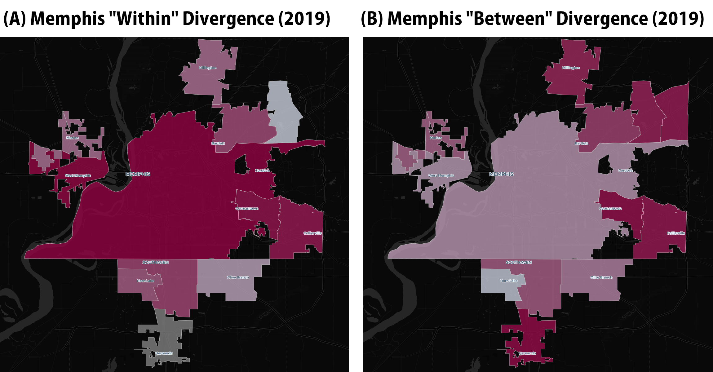
As Figure 1A illustrates, most of the segregation in the Memphis region is isolated within the municipal boundaries of the city of Memphis. Very little of the city’s segregation is classified as the “between” form (Figure 1B). Specifically, the 2010 “within” divergence score for the city of Memphis is 0.3075 whereas its “between” divergence score is just 0.0528. The opposite is true of Hialeah, as Figure 2, below, illustrates.
Figure 2: The Miami-Dade Metropolitan Region
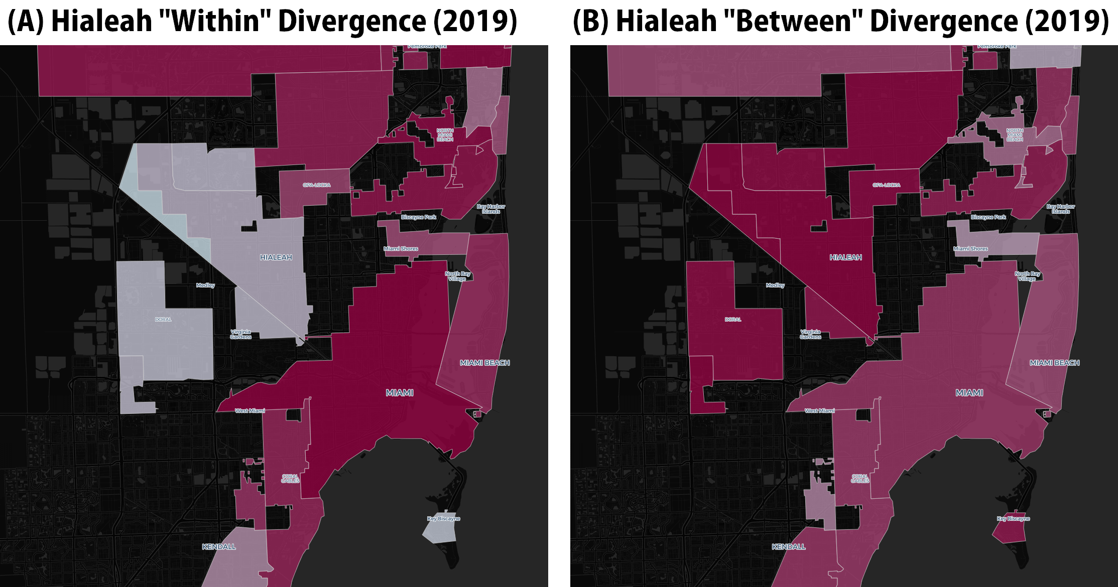
The contrasting shades in Figure 2 illustrate the dynamic, especially when compared to Figure 1. The vast majority of Hialeah’s 2010 divergence score is “between” segregation (Figure 2B), and very little is “within,” or neighborhood-segregation within the city’s boundaries (Figure 2A). Specifically, Hialeah's “within” divergence score is a mere 0.0083, whereas its “between” divergence score is 0.7527.
Between these two extreme cases are cities and regions like Newark, New Jersey or San Bernardino, California, whose ratios of “between” to “within” segregation is more evenly balanced.
But the Divergence Index formula’s ability to “decompose” segregation into its different forms is useful beyond simply understanding the particular form of segregation that confronts a particular city or region. It can help us also understand the general evolution and dynamics of racial residential segregation in the country, as alluded to in the main report. In particular, it can help us shift our understanding of residential segregation primarily as a neighborhood problem and see it more starkly in regional terms, as occurring between suburbs rather than simply neighborhoods within large cities.
The capacity to differentiate between these two forms of segregation is one of the most underappreciated assets of the Divergence Index because, since the 1960s, more and more segregation occurs not within cities, but between them.37 Large diverse cities still have a significant degree of “within” place segregation,38 but smaller, more homogeneous cities create segregation between places.39
The St. Louis metropolitan region is a prominent and important case in this regard. Michael Brown, one of the victims of a police shooting that helped trigger the Black Lives Matter movement, grew up in Ferguson, a segregated suburb of St. Louis. The “between” segregation lens, illustrated with our mapping tool in Figure 3 below, provides more precise and penetrating insights into his world.
Figure 3: St. Louis Region “Between” Segregation

As Figure 3 illustrates, Ferguson is one of the most segregated municipalities in the St. Louis region, but it is not so much internally segregated as it is segregated from the array of surrounding suburban jurisdictions, especially those southwest of Ferguson, including Wildwood, Glendale, Olivette, and so on. The Divergence Index helps us see this fact more clearly than many alternative measures of segregation.
This is not just analytically significant. The type of segregation that exists may also constrain or delimit the possibilities for addressing it. For example, student assignment plans drawn within school districts and municipal boundaries have little ability to achieve integration in a context like Ferguson, but could be effective in a place like Memphis, since most of the segregation is “within” the city itself. The only way to “integrate” the schools of Ferguson would be through an inter-district mechanism.
In the main report, we alluded to how the Divergence Index’s segregation scores can sometimes differ to a surprising extent from more traditional measures like Black-white dissimilarity. One obvious reason for this is that the segregation of Latinos and Asians may be increasing, even as Black-white dissimilarity values fall or plateau. The large percentage changes in racial composition presented in our table indicating changes in overall levels of segregation from 1990 to 2019 strongly suggests this. This is one of the principal reasons we find the Dissimilarity Index to be so potentially misleading as a holistic measure of American racial residential segregation.
But even if we re-run the divergence calculations to simply focus on Black-white divergence, we find that there remain substantial discrepancies between the two indices in terms of measured levels of segregation. Table 1 below presents the metropolitan areas with the greatest discrepancies in this regard.
Table 1: Highest Difference Between Black-White Divergence and Dissimilarity, 2010 Metro Areas (Minimum Population: 200,000)
| Rank | Metro | Black-White Divergence (Percentile) | Black-White Dissimilarity (Percentile) | Difference |
| 1 | Florence, SC MSA* | 82 | 20 | 62 |
| 2 | Gainesville, FL MSA | 79 | 32 | 47 |
| 3 | Raleigh-Cary, NC MSA | 79 | 36 | 43 |
| 4 | Lynchburg, VA MSA | 63 | 21 | 42 |
| 5 | Longview, TX MSA | 65 | 25 | 40 |
| 6 | Durham-Chapel Hill, MSA | 90 | 51 | 39 |
| 7 | Spartanburg, SC MSA | 75 | 36 | 39 |
| 8 | Las Vegas-Paradise, NV MSA | 59 | 22 | 37 |
| 9 | Charlottesville, VA MSA | 49 | 14 | 35 |
| 10 | El Paso, TX MSA | 44 | 11 | 33 |
(*Metropolitan Statistical Area)
The main takeaway from this table is that, even while focusing just on Black-white segregation, large discrepancies can exist between the two measures. A complete list comparing the percentile rank of both cities and metros between Black-white divergence and Black-white dissimilarity values is available here.
VI. Location Quotient
The location quotient of racial residential segregation (LQ) is a small-area measure of relative segregation calculated at the census tract level. LQ shows how much more or less a racial group is represented in the tract relative to the CBSA/County.40 An LQ of 1 means that a tract’s proportion of a given race is exactly equal to its CBSA/County. Higher and lower scores indicate over- or under-representation, respectively.
The strength of LQ is its ability to quickly show areas of concentration for a single race. However, it is limited to a single race, and is easily confounded when a CBSA/County has few members of a given race. Given its similarity for this purpose to the Isolation Index, it is important to note that one advantage of the LQ over the Isolation Index is that it can be derived for smaller geographies, such as census tracts.
We have included this measure into our mapping tool for comprehensiveness and overall utility. This measure is a useful and often quite insightful measure of segregation.
VII. Our Default Measure: “Segregation/Integration”
Finally, users will notice that the mapping tool’s default layer is denoted as “Segregation/Integration” or “Segregation/Integration - Detailed.” As we explain in our FAQ, the goal with the web map is to make the visual representation of segregation as intuitive as possible at first glance. Our bespoke and default layer, which we label “segregation/integration” best achieves this goal.
We explored different options for default maps and decided against using a simple, unmodified version of the Divergence Index as the default as this would have required additional interpretation and would have been mystifying to most users.
The default map has three categories within this layer: “High Segregation,” with geographic areas shaded in a magenta color, “Low-Medium Segregation” in a whitish gray, and “Racially Integrated,” shaded in blue.
“High Segregation” is any geography that falls in the top third of the country in the Divergence Index score. “Racially Integrated” are any geographies that fall into the bottom third third of the Divergence Index score percentile nationally, but is also at least 20 percent Black and/or Latino, and is in the top half of the country in Entropy Score (meaning diversity). “Low-Medium Segregation” is any selected geography that falls in between these two categories.
When you select “Segregation/Integration - Detailed,” the “High Segregation” category splits into two different categories: “High White Segregation” and “High People of Color (POC) Segregation.” The difference is, in our view, important, to avoid the tendency to conflate these two distinct types of racial residential segregation.
A place is labeled as “High White Segregation” if it is majority white, falls in the top third nationally of the Divergence Index, and has a white Location Quotient above 1.25. The “High POC Segregation” label is applied if the place is not majority white, but is in the top third of the Divergence Index nationally. We hope that clearly explains what this measure represents and is intuitive to users.
A Note on Racial Integration
A place could have a low level of segregation and yet not reflect what we would intuitively describe as “integrated.” This is because some places with little racial segregation may be racially homogeneous, with little underlying diversity to facilitate segregation.
The Divergence Index does a good job of indicating the separation of groups across space, but cannot, by itself, indicate if a place is truly “integrated.” That is why we have created a functionally “new” measure of integration for our map, a combination of both the Entropy Score and the Divergence Index.
That is why, as just noted, we define “Racially iIntegrated” not as a low level of observed segregation, but as any place geography that meets all of these additional conditions: 1) falls in the bottom third of the Divergence Index nationally, 2) has an Entropy Score in the top 50 percent nationally, and 3) has at least 20 percent Black and/or Latino population. We believe this combination of characteristics helps us identify geographies that are meaningfully integrated, not just the apparent absence of segregation.
Relatedly, any geography that has the Divergence Index in the top third nationally falls under the “High Segregation” category. Geographies that do not fall either under the “Racially Integrated” category or under the “High Segregation” category are labeled as “Low-Medium Segregation.”
To illustrate the difference, let us consider two cities: Aurora and Colorado Springs, both in Colorado, with similar population sizes in 2019. Aurora, with a population of about 370,000, has a Divergence Index score of 0.1747, an Entropy Score of 0.9704 and a combined Black and Latino population of 44 percent. Colorado Springs, with a population of about 465,000, has a Divergence Index score of 0.0628, Entropy Score of 1.29 and a combined Black and Latino population of 22 percent. Both cities meet criteria #2 and #3, but Aurora’s Divergence Index is in the middle-third nationally. Thus, Aurora is categorized as Low-Medium Segregation whereas Colorado Springs is designated as racially integrated on our map.
VIII. Economic Segregation Measure: Dissimilarity
Economic segregation is an important phenomena to study and understand in its own right, but economic segregation can exacerbate or amplify racial segregation. Understanding the relationship and dynamics between the two phenomena is important. Therefore, we have decided to include measures of economic segregation into our mapping tool as well, making our mapping tool even more expansive and comprehensive.
We conducted a comprehensive literature review of economic measures of segregation, and ultimately settled on just three for inclusion into our mapping tool at this time, with the possibility of adding more in the future. Each of our selected measures are based on 2019-2023 ACS 5-yr estimates, and are not calculated for other years.
We reviewed a variety of different ways to apply the Dissimilarity Index to income, but settled on an approach which has two subcomponents: the segregation of the poor (households with annual income below $30,000) and the segregation of the wealthy (households with annual income over $200,000), and then combines them into a single index.
The Federal poverty level for a family of four for 2023 is listed as $30,000 as per the Department of Health and Human Services. The two income bins provided by Census around this figure are $15,000-$24,999 and $25,000-$34,999. For our calculations, we considered $25,000 as the poverty level and calculated the Dissimilarity Index for the poor. Similar to the “segregation for the affluent,” we used $200,000 as the income level.
We applied this framework to calculate income segregation for cities, counties and CBSAs using 2019-2023 ACS 5-yr estimates. Since tract level data contributes to the overall Dissimilarity scores for bigger geographies, tract-level data for this measure is not available.
Since the first two measures in this list are based on the Dissimilarity Index, it follows the properties of this index. A score of ‘0’ would mean no income segregation while ‘1’ would mean the geography is dominated by one income group. When the two measures are combined, it no longer follows the properties of the Dissimilarity Index, but lower values still mean low segregation whereas higher values mean high segregation. Nonetheless, the combination could lead to less intuitive outcomes. Since the two measures are combined together, in most cases it’ll be hard to know if the overall segregation is due to poor or affluent segregation. Also, this measure ignores the middle income categories that can contribute significantly to income segregation. Thus, this measure ignores broader income segregation dynamics.
IX. Economic Segregation Measure: Relative Neighborhood Income Category
The second economic segregation measure we included on our mapping tool is a relatively new measure that looks at the proportion of households that live in the poorest and most affluent neighborhoods in metropolitan areas. Denoted the “Relative Neighborhood Income Category,” the measure sorts neighborhoods into six categories: 1) poor (median income ratio < 0.67), 2) low income (ratio between 0.67 and 0.80), 3) low-middle income (ratio between 0.80 and 1.0), 4) high-middle income (ratio between 1.0 and 1.25), 5) high income (ratio between 1.25 and 1.5), and 6) affluent (ratio > 1.5) based upon median household income41 relative to the metropolitan median household income.
X. Economic Segregation Measure: Income Polarization Index
Another measure, named Income Polarization Index, yields a score for the place, county and metro area based on the sum of the proportion of the households that live in the poorest neighborhoods and those living in the wealthiest.42
We used the sum of proportions of tracts within the bigger geography (CBSA, county, place) that fall into “poor” and “affluent” categories. A higher proportion suggests higher levels of income segregation as this would mean fewer tracts in the middle income categories e.g. Monroe, LA is the CBSA with the highest score in this category (0.6156 or 61.56%). This means that the poor and affluent neighborhoods makeup 61.56% of the CBSA.Relatedly, Batavia, NY, a Micropolitan Statistical area has the lowest score of 0.007 or 7%.
The advantage of this measure is that it is intuitive and interpretable.43 However, there are two shortcomings of this measure. First, the categorization or demarcation of the neighborhoods is relatively arbitrary. Second, the measure could confound income inequality with income segregation.
XI. Economic Segregation Measure: Income Entropy Score
The fourth measure we selected for inclusion is the entropy score for income, which is calculated similarly to the entropy score for racial diversity.44 The census provides 15 different bins of income classes for which the Entropy score can be calculated. In our calculations, we consolidated these 15 bins into 5 bins, and calculated the measure. The five bins are: Less than $50k; $50k and above but less than $100k; $100k and above but less than $150k; $150k and above but less than $200k; $200k and above
As with the entropy score for race, this is a measure of income diversity, not segregation per se. It is useful for indicating how economically diverse a region is, but it is not a direct measure of the separation of economic groups. The formula and measure is not sensitive to the distribution of households in the bins. The same value can be produced with different proportions across the bins.
Since the formula utilizes logarithmic calculations, 0 values or extremely low values can pose problems. While the log of ‘0’ is undefined, the log of extremely low values results in high negative values. Entropy measures relative distribution only. It doesn't account for overall income levels e.g. two communities with different proportions of households in each income bin can have the same entropy score.
Getting the Most from our Mapping Tool
As described above, the default geography of the map is CBSAs and Counties. Users may switch to cities or census tracts. The level of segregation indicated is keyed to the Divergence Index (low, medium and high), while areas deemed “integrated” are based upon the criteria mentioned in the preceding section.45 Users may then switch to different levels of geography, measures of segregation, or years and observe the results.
For tract-based measures (such as the Divergence Index, Entropy, or Location Quotient) each tract is compared to its CBSA/County in this project. Measures of CBSA and city segregation are aggregated from their internal tracts. Because cities do not adhere to tract boundaries, tracts are assigned to the city using the location of their population-weighted centroids. Both segregation measures and place demographics are aggregated in this manner, meaning that some population figures in the map may differ slightly from the official statistics the Census Bureau reports for each city.
Figure 3 in the main report shows the Divergence Index result for tracts in and around the city of Detroit. In addition to displaying the same view of the area, the mapping tool allows users to switch to different measures of segregation, providing a more detailed and nuanced view of segregation than is usually possible. Figure 4 below illustrates the capacity of the mapping tool to display different dimensions of segregation from which to observe different aspects of this problem. The map also ranks each tract, place, and CBSA/County by percentile so users can discern gradients in the level of segregation.46


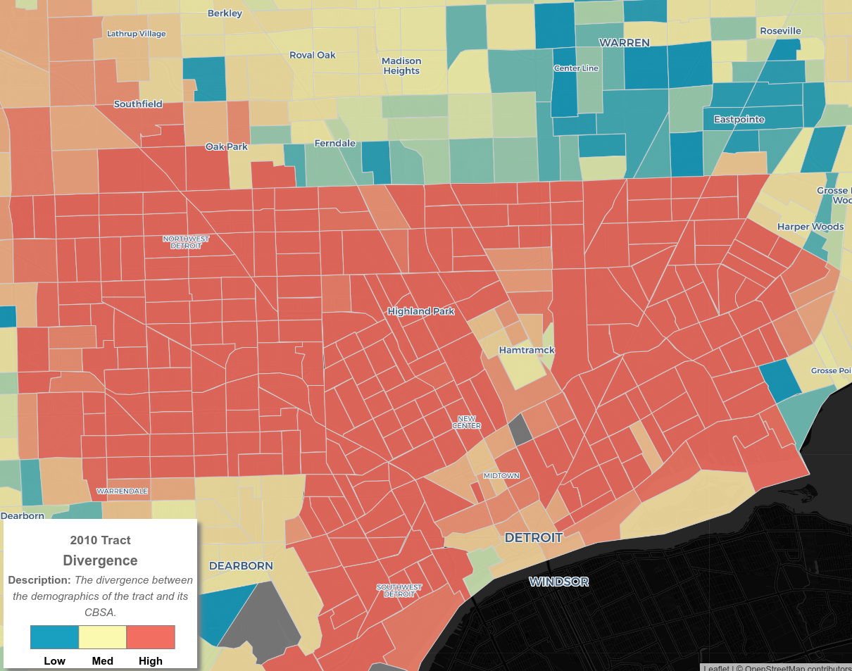

Figure 4A shows Detroit’s overall segregation using the divergence index. Figure 4B shows Detroit’s Black isolation within the city. As the juxtaposition illustrates, there is a strong correlation between the two measures in the case of Detroit. Our mapping tool allows users to zoom into particular neighborhoods within Detroit to see where segregation and isolation are occurring (Figure 4C).
Finally, our mapping tool allows users to observe segregation between cities within a metropolitan area. Figure 4D shows that the city of Detroit is less diverse than some of its municipal neighbors. Detroit is a highly segregated city, with a nearly 80 percent Black population and nearly 11 percent white population, while also being fairly racially diverse for its metro region which is over 66 percent white and over 22 percent Black, making clear the role of inter-municipal segregation as contrasted with intra-municipal or neighborhood segregation. Conclusion
This appendix described all thirteen (13) measures of racial and economic segregation) employed by our mapping tool, including our novel and default measure of integration, provided the formulas for each, described what each measure represents, and noted their deficiencies and limitations.
We wish to emphasize that while we prefer the Divergence Index for the purposes of this project, there is no "perfect" measure of segregation. Each measure provides some insight into the phenomenon of segregation, while also concealing other facets of the problem. Users should select the measure that is most sensitive to the aspect of segregation they seek to understand or evaluate.
Our mapping tool does not exhaust every conceivable measure of segregation, let alone every measure we have encountered and catalogued. However, it provides a comprehensive, panoramic view of segregation using the most widely known or best measures of segregation available. We hope that our map is useful for whatever purposes you may have in mind or subsequently discover.
For researchers or practitioners who are struggling to decide which measure to select for their needs, the full value of our mapping tool may be that it allows users to toggle easily between different measures and observe their community from many different angles, and thereby draw deeper insights made possible by examining the many facets of the matter. With deeper understanding may come better solutions. At least, that is our hope.
If you would like direct access to some of the data behind our tool, please use our request form embedded in the mapping tool, and we will respond to your request as soon as possible.
If you have any further questions or requests, do not hesitate to reach out to us at HousingOBI@berkeley.edu.
- 1Kyle VanHemert, “The Best Map Ever Made of America's Racial Segregation,” Wired, August 26, 2013, https://www.wired.com/2013/08/how-segregated-is-your-city-this-eye-opening-map-shows-you/.
- 2Aaron Williams and Armand Emamdjomeh, “America is More Diverse Than Ever — But Still Segregated,” Washington Post, published May 2, 2018; last modified May 10, 2018, https://www.washingtonpost.com/graphics/2018/national/segregation-us-cities/.
- 3Jonathan Chipman et al., “MixedMetro: Mapping Diversity and Segregation in the USA,” accessed May 7, 2021, http://www.mixedmetro.us/.
- 4See E.g. Johnny Finn, “Mapping Segregation,” Living Together/ Living Apart, accessed May 7, 2021, https://www.arcgis.com/apps/Cascade/index.html?appid=5ccb9580d7a9489c918d57ab04af7296
- 5See the definition of “segregation” in the Oxford English Dictionary online. “Segregation,” Oxford English Dictionary, accessed May 7, 2021, https://en.oxforddictionaries.com/definition/segregation.
- 6Ulrich Boser and Perpetual Baffour, Isolated and Segregated: A New Look at the Income Divide in Our Nation’s Schooling System (Washington, D.C.: Center for American Progress, 2017), 2, https://www.americanprogress.org/issues/education-k-12/reports/2017/05/31/433014/isolated-and-segregated/.
- 7Stephen Menendian and Samir Gambhir, Racial Segregation in the San Francisco Bay Area, Part 3: Measuring Segregation (Berkeley, CA: Othering & Belonging Institute, 2019), https://belonging.berkeley.edu/racial-segregation-san-francisco-bay-area-part-3. See text associated with endnotes 8-15.
- 8Sean F. Reardon and David O’Sullivan, “Measures of Spatial Segregation,” Sociological Methodology 34, no. 1 (2004): 121-162, https://doi.org/10.1111/j.0081-1750.2004.00150.x.
- 9In their landmark book American Apartheid, Douglas Massey and Nancy Denton describe segregation in five different ways: (un)evenness, exposure, concentration, centralization, and clustering. Douglas Massey and Nancy A. Denton, American Apartheid: Segregation and the Making of the Underclass (Cambridge, MA: Harvard University Press, 1993), 75-76. Subsequent scholarly analysis has led to the conclusion that these five concepts map two different gradients: 1) Eveness-Clustering and 2) Isolation-Exposure. For a summary of this debate, see Sean F. Reardon and David O’Sullivan, “Measures of Spatial Segregation,” Sociological Methodology 34, no. 1 (2004): 121-162, https://doi.org/10.1111/j.0081-1750.2004.00150.x.
- 10“Census Tracts,” (presentation, Geographic Products Branch- United States Census Bureau), https://www2.census.gov/geo/pdfs/education/CensusTracts.pdf.
- 11“Geographic Levels: Counties,” United States Census Bureau, https://www.census.gov/programs-surveys/economic-census/guidance-geographies/levels.html.
- 12“Glossary,” US Census Bureau, last modified September 16, 2019, https://www.census.gov/programs-surveys/geography/about/glossary.html#par_textimage_7.
- 13Dissimilarity Index=0.5*⅀|(xim/Xm) - (xip/Xp)| where xim is the population of a racial group m within a smaller geography i, Xm is the population of the same racial group m within the bigger geography, xip is the population of a racial group p within the same geography i, and Xp is the population of the same racial group p within the same bigger geography. The absolute difference between these two proportions are summed over all smaller geographies that constitute the bigger geography, and then divided into half.
- 14See e.g. Richard H. Sander, Yana A. Kucheva, and Jonathan M. Zasloff, Moving Toward Integration: The Past and Future of Fair Housing (Cambridge, MA: Harvard University Press, 2018), 37.
- 15John R. Logan and Brian J. Stults, The Persistence of Segregation in the Metropolis: New Findings from the 2010 Census (Washington, D.C.: United States Census Bureau- US2010 Project, 2011), 25, https://s4.ad.brown.edu/Projects/Diversity/Data/Report/report2.pdf.
- 16This problem is actually several related problems pertaining to the fact that units of geography such as census tracts change boundaries over time, that different sized geographies are difficult to compare, and that the level of geography employed can produce different results. In general, larger geographies appear less segregated because they are more diverse. But the more detail that is visible, the more segregated an area can appear. See Social-Spatial Segregation: Concepts, Processes and Outcomes, chs. 7, 10, 13, 17 (Christopher Lloyd, Ian Shuttleworth & David Wong eds., 2014). The authors in Social-Spatial Segregation creatively address this problem by using alternative indices or by standardizing their analysis by population density or size. See also Massey & Denton, supra note 3, at 31 (“Blocks are substantially smaller than wards, and the degree of segregation that can be measured tends to increase as the geographic size of the unit falls.”). Sander, Kucheva, and Zasloff acknowledge one strain of this problem with respect to the dissimilarity index. See Richard H. Sander, Yana A. Kucheva, and Jonathan M. Zasloff, Moving Toward Integration: The Past and Future of Fair Housing (Cambridge, MA: Harvard University Press, 2018), 37., 522 n.15 (noting that “the Index of dissimilarity becomes progressively more inaccurate and misleading as either the overall population of the area analyzed, the number of geographic units, or the relative size of either of the compared groups becomes smaller”). See: Stephen Menendian and Richard Rothstein, “Putting Integration on the Agenda,” Journal of Affordable Housing 28, no. 2 (2019): 153, https://belonging.berkeley.edu/putting-integration-agenda.
- 17Sander, Kucheva, and Zasloff, Moving Toward Integration, 522.
- 18There is, however, an exception where some researchers have access to more granular census data and can generate dissimilarity scores at a smaller geography. See Id.
- 19Isolation Index = ∑ (xim/Xm) * (xim/ti). The value is summed over all smaller geographies e.g. census tracts, that make up the bigger geography e.g. city, where xim is the population of a racial group m within a smaller geography i, Xm is the population of the same racial group within the bigger geography, and ti is the total population within the smaller geography. The value ranges from 0 to 1 where higher values mean higher racial isolation.
- 20Exposure Index = ∑ (xim/Xm) * (xip/ti). The value is summed over all smaller geographies, say, census tracts, that make up the bigger geography, say, city, where xim is the population of a racial group within a smaller geography i, Xm is the population of the same racial group m within the bigger geography, xip is the population of the racial group p against which the exposure is being calculated, and ti is the total population within a smaller geography. The value ranges from 0 to 1 where lower values mean lower exposure to the other racial group.
- 21John R. Logan and Brian J. Stults, Metropolitan Segregation: No Breakthrough in Sight (Providence, RI: Diversity and Disparities Project, Brown University, 2021), https://s4.ad.brown.edu/Projects/Diversity/Data/Report/report08122021.pdf.
- 22There is a related problem, in that the mean-based approach to calculating the exposure index may tend to overstate actual exposure for the “typical” (rather than “average”) case. One scholar has proposed a median-based version of the formula to address this issue, but we have not incorporated this approach into our mapping tool. See John E. Farley, “Residential Interracial Exposure and Isolation Indices: Mean Versus Median Indices, and the Difference It Makes,” The Sociological Quarterly 46, no. 1 (2005): 19-45.
- 23The formula used in calculating the entropy score is Ei= ∑xim Ln(1/ xim), where xim is the proportion of racial group m within the geography. Ei is the entropy score for geography i. Value of E for n groups within a geography ranges from the maximum value of Ln(n) if all groups have the same proportion, to 0 if the geography is dominated by one group only. The final score is scaled from 0 to 1 by dividing the entropy score by Ln (n).
- 24Chipman et al., “MixedMetro.”
- 25Diversity Index = 1-⅀(Xim)2 where Xim is the proportion of a racial group m within any geography i. These racial groups have to be mutually exclusive. The value ranges from 0, which represents a geography without diversity, to 1, which represents a geography with maximum diversity. The racial proportions included in the formula, which are used by the U.S. Census Bureau as well as within our calculations, are the following: Hispanic/Latinx, White, Black, American Indian and Alaskan Native (AIAN), Asian, Native Hawaiian and Other Pacific Islander (NHPI), and Other (a composite of Some Other Race and Two or More Races)–with all racial and ethnic subpopulations following Hispanic/Latinx being exclusive of the category.
- 26See White, M. J. (1986). Segregation and Diversity Measures in Population Distribution. Population Index, 52(2), 198–221. https://doi.org/10.2307/3644339; as well as Jensen, E., Jones, N., Orozco, K., et al. (2021). Measuring Racial and Ethnic Diversity for the 2020 Census. United States Census Bureau. https://www.census.gov/ newsroom/blogs/random-samplings/2021/08/measuring-racial-ethnic-diversity-2020-census.html
- 27John Iceland, “The Multigroup Entropy Index (Also Known as Theil’s H or the Information Theory Index),” US Census Bureau, December 2004, https://www2.census.gov/programs-surveys/demo/about/housing-patterns/multigroup_entropy.pdf.
- 28Theil Index or Entropy Index H = ∑ti*Ei/T*E, where ti is the population of the smaller geography i, Ei is the entropy score for the smaller geography i, T is the population of the bigger geography, and E is the entropy score for the bigger geography.
- 29We used the R-segregation package provided by Benjamin Elbers.
- 30Elizabeth Roberto, “The Divergence Index: A Decomposable Measure of Segregation and Inequality,” aRxiv, December 2, 2016, https://arxiv.org/pdf/1508.01167.pdf.
- 31The formula for the Divergence Index for location i is DIi = ∑xim Ln(xim/ xm), where xim is the proportion of racial group m within the smaller geography i, xm is the proportion of racial group m within the bigger geography, and DIi is the Divergence Index for this geography. The lowest value of DI is ‘0’ when the demographics of a smaller geography are similar to that of the larger geography. Higher values suggest higher segregation.
- 32See footnote #12 in the main report for the racial taxonomy. Divergence Index requires mutually exclusive racial groups for the index calculations.
- 33Divergence Index for this tract = [0.093*Ln(0.093/0.667)]+[0.76*Ln(0.76/0.119)]+[0.119*Ln(0.119/0.108)]+[0.028*Ln(0.028/0.106)] = 1.21
- 34The upper bound on divergence is the natural log of the number of races, which varies depending on Census data. For 2010, the maximum value would be Ln(7), the races being: white, Black, Hispanic, Asian, Native American, Native Hawaiian or Pacific Islander, and all other races as a single group.
- 35In our attempt to apply this index to the 9-county Bay Area, we classified any score below .1075 as “low,” and any score above .215 as “highly” segregated, with any score falling between those values as “moderately” segregated. These values do not necessarily generalize either to the United States as a whole, nor to either the city or CBSA/County, which are compiled from tract scores. See Stephen Menendian and Samir Gambhir, Racial Segregation in the San Francisco Bay Area, Part 1: Segregation (Berkeley, CA: Othering & Belonging Institute, 2018), https://belonging.berkeley.edu/racial-segregation-san-francisco-bay-area.
- 36Divergence score is the sum total of “within” Divergence and “between” Divergence.
- 37Claude S. Fischer et al., "Distinguishing the Geographic Levels and Social Dimensions of U.S. Metropolitan Segregation, 1960-2000," Demography 41, no. 1 (2004): 46, http://www.jstor.org/stable/1515212.
- 38The “within” divergence score for a place, county or CBSA is the population weighted sum of divergence values of all tracts within each of those respectively.
- 39See e.g. Stephen Menendian, Arthur Gailes, and Samir Gambhir, The Most Segregated (and Integrated) Cities in the SF Bay Area (Berkeley, CA: Othering & Belonging Institute, 2020), https://belonging.berkeley.edu/most-segregated-and-integrated-cities-sf-bay-area
- 40Location Quotient = (xim/xi)/(Xm/X) where xim is the population of a racial group m within a smaller geography i, xi is the total population of the same geography i, Xm is the population of the racial group m within a bigger geography e.g. MSA with smaller geographies i, and X is the total population of the bigger geography. A value of 1 for this measure suggests that the racial group m at the bigger geography has the same proportion as in the smaller geography. A value greater than 1 for this measure suggests that the racial group m has a higher concentration within the smaller geography compared to the bigger geography.
- 41Reardon and Bischoff (2011 & 2016) choose to look at families rather than households in their study. They chose to do this because they were particularly interested in children’s experiences with income segregation, but the definition of a household is not dependent on children living in the home, while the definition of a family is (2011, 7). Additionally, Reardon and Bischoff incorporate a racial perspective in their analysis and income data for households by race is not available for all census years. Reardon and Bischoff, Growth in Residential Segregation; Sean F. Reardon and Kendra Bischoff, The Continuing Increase in Income Segregation, 2007-2012 (Stanford, CA: Stanford Center for Education Policy Analysis, 2016), https://cepa.stanford.edu/content/continuing-increase-income-segregation-2007-2012.
- 42Reardon and Bischoff, Growth in Residential Segregation, 22.
- 43Reardon and Bischoff, Growth in Residential Segregation, 9.
- 44The formula used in calculating the entropy score for income segregation is Ei= ∑xim Ln(1/ xim), where xim is the proportion of households m within the geography. Ei is the entropy score for geography i. Value of E for n income bins within a geography ranges from the maximum value of Ln(n) if all income bins have the same proportion, to 0 if the geography is dominated by one income bin only.
- 45Our map defines as “high segregation” any tract in the top third of the divergence index nationally, and medium to low as any tract that is neither highly segregated nor integrated. And we define “integrated” not as a low level of observed segregation, but as any place that meets all of the following conditions: 1) falls in the bottom third of the Divergence Index nationally, 2) has an Entropy Score in the top 50 percent nationally, and 3) has at least 20 percent Black and/or Latino population.
- 46For CBSA/County, Metropolitan Areas, Micropolitan Areas, and Counties are each ranked on their own scale, so this may result in a higher percentile score, but lower divergence score for some geographies relative to others on our map.

