Published: March 24, 2020
Last updated: December 2020
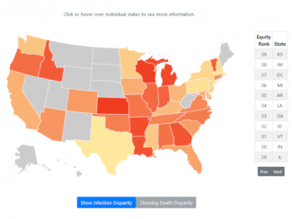
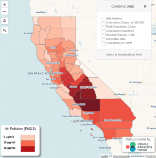
As part of the effort to respond to the needs of the most vulnerable and impacted groups during the ongoing and rapidly developing coronavirus pandemic we've developed: 1. an interactive heat map of the United States showing how different states across the country are experiencing disparities in infection and death rates by race; 2. an interactive webmap of California that includes multiple layers and metrics to identify regions facing increased risks associated with the pandemic; 3. a series of static maps that identify regions throughout California that may be in most need of resources and support; and 4. a series of infographics that help visualize the impacts of the pandemic on different population. The maps and graphics serve as tools to assist aid organizations and nonprofits working on the ground to reach particular groups, government agencies working on plans to allocate resources, health organizations, and the media. Scroll down to view the interactive maps and for links to the sets of static maps and infographics.
Interactive Maps
COVID-19's impact in the United States has been disproportionately experienced in Black and Hispanic/Latinx communities. This interactive heat map displays and ranks each state by the extent to which the racial differences in COVID-19 rates of infection and deaths have diverged from each state's general population. The redder the state, the greater the COVID-19 racial disparity. See our press release for more information.Our interactive map of California includes multiple layers and metrics that identify regions across the state that may face increased risks associated with the pandemic, and includes measures such as air pollution, hospital beds per capita, regions lacking health insurance, and many others. The map is continuously being updated with new information.
Static Maps & Infographics
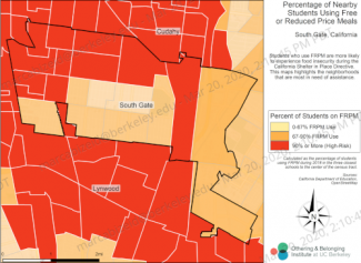
K-12 students using free or reduced-price meals
Kindergarten through Grade 12 students who benefit from free or reduced-price meals are more likely to experience food insecurity during the California Shelter in Place Directive. This set of maps highlights the neighborhoods that are most in need of assistance.
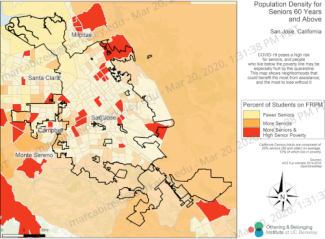
COVID-19 poses a high risk for seniors, while people who live below the poverty line may be especially hurt by the quarantine. This set of maps show neighborhoods in California that could benefit the most from assistance.
Hospital beds per capita by county
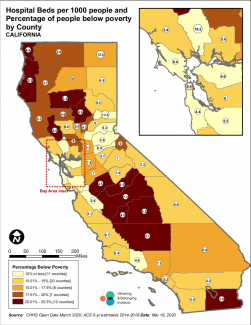
This set of maps shows the number of hospital beds per 1,000 people located in each county in California, as well as the percentage of people from different racial groups and elderly people living in poverty in those counties.
Our collection of infographics helps visualize the impacts of the coronavirus pandemic on working people and renters in California. The infographics reveal a correlation of infections and unemployment claims; the proportion of racial groups who work in "non-essential" industries which have been shuttered; and show the proportion of renters by race.
